We are so proud and honored to serve the arXiv community who, despite the global turmoil caused by the COVID-19 crisis, are more committed than ever to advancing scientific research. At arXiv our commitment to improving the platform with changes large and small continues as well.
We recently held a survey to assess new incremental updates to the mobile-friendly display of the abstract page. First of all, we want to extend a huge thank you to all of the survey participants. Participation levels were high and we really value your time and your insights.
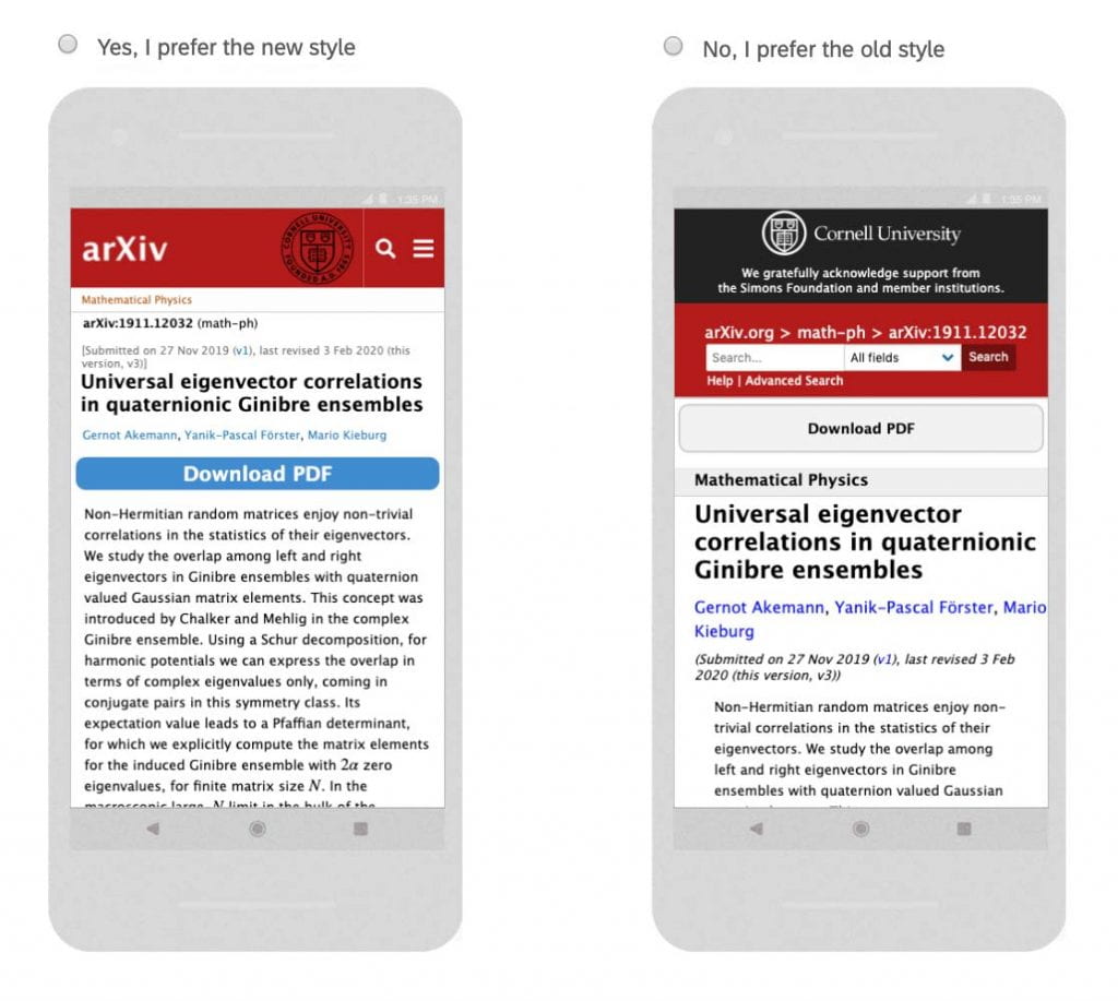
In our survey we asked participants to review the proposed abstract page on their mobile device and then rate its usability against the current live page:

Some of the main changes include reducing the height of the header, adding mobile-friendly navigation and search links, and moving the download button. We also made the citations section (not shown in the screenshots above) more user friendly on touch screens.
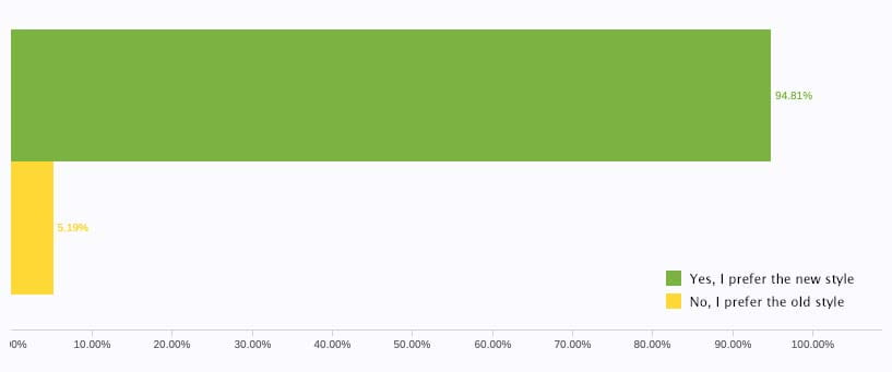
Users overwhelmingly found the proposed abstract page style improved their experience on mobile devices:
- Yes, I prefer the new style: 94.81%
- No, I prefer the old style: 5.19%

Users also provided valuable feedback on other aspects of the UI which we are cataloging to inform future updates. We will push these mobile-friendly edits to the live site this week, so if you access arXiv on your phone you’ll notice some changes on the abstract page.
Thank you for helping us improve arXiv.
-The arXiv NG team
Want to join our next user testing survey? From time to time arXiv sends out surveys, previews to new changes, and other testing opportunities to interested users. To join our user testing group sign up here. User testing is integral to arXiv’s development process and we welcome your feedback.