Pop quiz: There are so many “-Xivs” online and on social media. Which ones are operated by arXiv?
Answer: only arXiv.org and @arXiv
arXiv is a highly valued tool known primarily through its digital presence. However, the use of arXiv’s name by other services has led to confusion. And despite decades of reliable service, arXiv’s inconsistent visuals and voice have projected an air of neglect. This jeopardizes our ability to raise funds for critical improvements.
“As the role of arXiv in open science becomes more evident, its value should be made obvious lest we end up losing the system we cherish and rely upon so much,” said Alberto Accomazzi, PhD, ADS Program Manager.
In 2020, Accomazzi joined nine other diverse community members to become part of an advisory group formed to support arXiv’s communications and identity project. The goal? To ensure that the way we present ourselves to the world reflects arXiv’s true nature as a professional, innovative tool created by and for researchers.
Throughout the identity project, we:
- assessed user feedback collected since 2016,
- surveyed board members and 7,000 additional users about their perceptions of arXiv,
- gathered ten diverse community members to serve as advisors,
- contracted with a professional designer to produce a logo, and
- are working with an accessibility consultant to address the needs of all arXiv readers and authors.
To guide our branding efforts we focused on arXiv as a place of connection, linking together people and ideas, and connecting them with the world of open science. After many rounds of revision and refinement, arXiv’s first brand guide was produced, in addition to our new logo and usage guidelines, and we’d like to share them with you now.

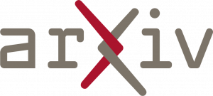
The arXiv logo looks to the future and nods to the past with a font that pays homage to arXiv’s birth in the 90’s while also being forward looking. The arms of the ‘X’ retain stylistic elements of the ‘chi’ in our name, with a lengthened top left and lower right branch. Symbolically, the intertwining of the arms at the heart of the logo captures the spirit of arXiv’s core value. arXiv is a place of connection, linking together people and ideas, and connecting them with the world of open science.
The brand guide and usage guidelines ensure that we express arXiv’s identity with consistent quality and continuity across communication channels. By strengthening our identity in this way, arXiv will be recognizable and distinct from other services. Staff will save time by having access to clear, consistent guidelines, visual assets, and style sheets, and collaborators will know the expectations regarding arXiv logo usage.
The arXiv community will notice that the main arXiv.org site remains the same at this time. That’s because the identity rollout and implementation process will be gradual, starting with official documents before moving to core arXiv services.
“arXiv must take control of its identity to maintain its place and grow within the scholarly communications ecosystem,” said arXiv’s executive director Eleonora Presani, PhD.